Fashion Color Wheel: Ultimate Guide To Match Colors
Wondering how you can pair up your clothes? Make your life easy with these ideas.

Image: Created with Dall.E
If you want to understand the fashion color wheel, then, you, my friend, are definitely in the right place because we are here to help. Today, in this article, we are going to show you how to marry the colors well so that they can suit you perfectly and create a color contrast without upsetting the color balance. It is important to have a better understanding of how colors work because you can either make or break your look as a result of the colors you choose for your outfits. If the colors are not well put together, your look will not come out the way you want, no matter how expensive your attire is. But do not worry because, once you give this article a read, you will be acquainted with the ultimate color wheel theory to ace your fashion game.All you need to do is, scroll down and check what we have in store for you. So go ahead!
 Ace The Look
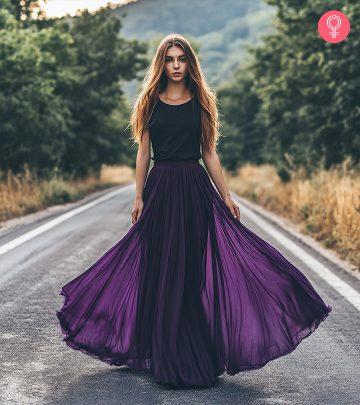
- Split Complementary Colors: Here you pick either of the immediate shades beside the complementary color. For example, pair orange earrings with a deep blue or purple blouse. For a subtler look, add a saffron scarf to an earthy purple tee or thistle purple sweater.
- Contrasting Colors: Wear contrasting colors like red and green, blue and orange, purple and yellow, or white and black. Ensure one color dominates (70%), while the other acts as an accent shade (30%) to balance your look.
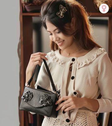
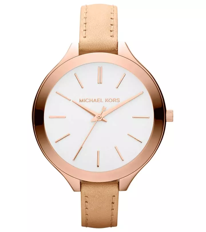
- Accessorize: Match your handbag to your shoes or clothes. For warm colors like yellow and orange, choose gold jewelry. Opt for silver or platinum jewelry for cool shades like blue and purple.
- Neutral Denim: Treat denim pieces as neutrals, and pair shades of denim that are similar but not too matchy together, like mid-wash jeans with a light-wash denim shirt.
In This Article
How To Know What Colors To Match
Using the right colors and matching them perfectly can be a deal maker. Choosing the perfect color palette for an outfit is what sets you apart. And, that’s why color and its theories continue to be the pivot for not just clothes, but everything else like interiors, hair, makeup, and much more. To make the colors work for you, it is essential to understand the color harmony theory and color psychology. We have put this article together by compiling information from different sources such as color theories, testing color combinations with digital tools, understanding the sheen and texture of fabrics, consulting expert stylists, and researching fashion history and current trends. By combining these insights, we provide a comprehensive approach on using the fashion color wheel to create visually harmonious and balanced looks.
To explain this further, let’s first understand the basis of this whole color wheel theory.
Key Takeaways
- To create a split-complementary color scheme, pick a color and pair it with the colors next to its complementary color.
- Analogous color matching involves combining two or three continuous shades on the color wheel for a striking and stylish look.
- Triadic color matching or color blocking refers to the combination of colors that are equidistant from each other on the color wheel.
- It is best to blend different shades of the same color.
- To look your best, select colors that complement your skin undertone.
The Color Wheel
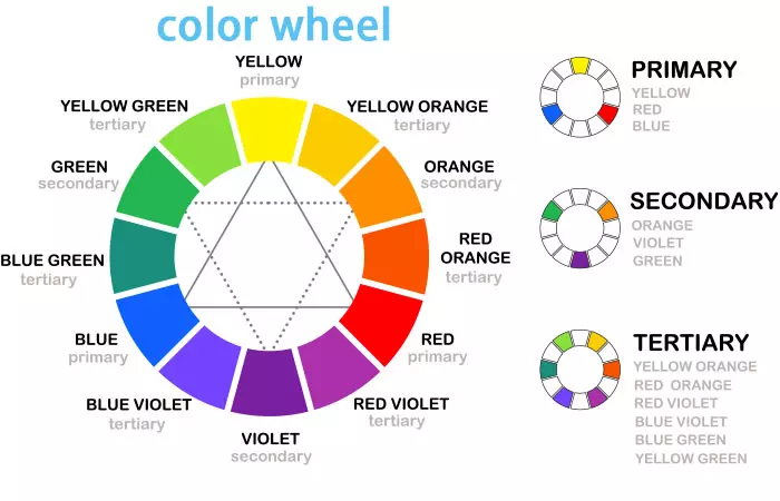
The color wheel was first invented by Sir Isaac Newton in the 18th century when he tried to condense the color spectrum into a wheel and visually represent the relationship between them. The wheel has been segregated into the following categories. While we will focus on using a color wheel for clothes and outfits, this theory is universal and applies to just about anything that deals with colors. The fashion color wheel has been segregated into the following categories.
- Primary Colors
These comprise red, yellow, and blue. No two colors can be mixed to achieve these shades. Everything else is derived from these colors.
- Secondary Colors
Secondary colors are a combination of the primary colors. So, red+yellow = orange, red +blue = purple, and blue+yellow = green.
- Tertiary Colors
These colors are a combination of primary and secondary colors. By mixing these colors, you get shades like mint, aqua colors, corals, etc.
- Warm And Cool Colors
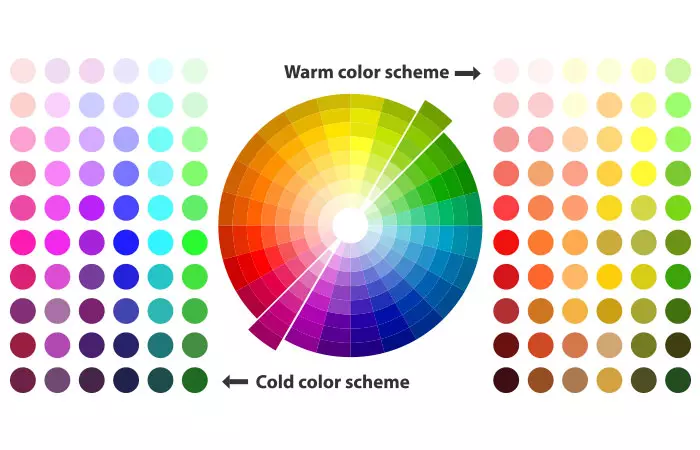
Hues of colors like red, orange, yellow, brown, etc. are warm colors – they make things look smaller in size, and that’s why most of us prefer wearing warmer colors when we want to look slimmer. Cool colors, like hues of blue, purple, green, etc., are soothing colors.
- Neutral Colors
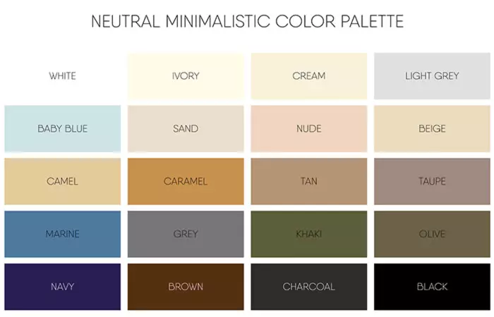
Neutral colors are self-explanatory. They are just muted, plain, and subdued. Black, grey, whites, off-whites, taupe, etc., fall into the neutral category.
 Did You Know?
You also need to keep in mind what colors will go well with your skin tone. Scroll down to the next section to learn about color temperature.
Clothing Color Temperature
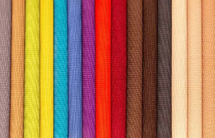
Color temperature plays a critical role in determining your overall appearance. The warmth or coolness of the color can help enhance your skin tone and even convey your mood and emotions. Also, wearing color tones that match your undertones can uplift your look and make your skin look healthier and brighter. While the wrong color tone can make skin look washed out or dull.
Colors hold psychological significance and can greatly affect our moods and emotions. For instance, red is associated with passion and energy. It is a vibrant choice for when you want to feel lively or bold. Orange clothes radiate enthusiasm and warmth, perfect for days you are feeling energetic and need something to uplift your mood. Yellow brings happiness and hope and wearing it can make you feel happy and gleeful. If you are feeling relaxed and calm, green is your color. Wearing bue makes one feel confident and calm at the same time. It is a sought-after color when it comes to work settings. Pink represents love and can be perfect for romantic occasions, such as a date. Neutrals like beige, brown, and white represent luxury and give an elegant and sophisticated vibe. Thus, understanding the various effects of the colors on our feelings and emotions allows us to consciously choose what to wear. These connections communicated nonverbally through color enrich our dressing style.
You can make the right fashion choice by understanding color temperature and how it goes with the season, occasion, skin tone, and mood. Check out the next section to see what you should keep in mind while matching colors.
What Are The Principles For Matching Colors?
One fundamental principle for matching your clothes, or for that matter anything, is combining colors that work in harmony. And, that’s what we need to remember while designing or putting our outfits together.
Here is how you can match them using the fashion color wheel.
- Complementary
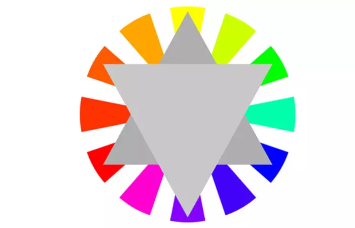
Red and green, violet and yellow, blue and orange – complementary colors, as the name goes, work best when put together. These are exactly opposite to each other on the color wheel. They might seem bold to look at, but the outputs will be perfect. If you observe carefully, your spring and summer clothing is mostly designed using complementary colors. While some might argue against this concept, it is actually a matter of choice as some like making bold statements.
 Quick Tip
- Analogous
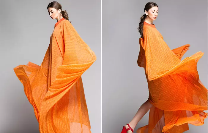
Matching two or three continuous shades on the color wheel that blend well with each other is called analogous color matching. When you put an entire outfit together based on this, it looks both striking and stylish. If you are wondering how to style that orange or camel trench coat of yours, pick a shade on either side of the color in the color wheel and work with that.
- Triadic
The combination of colors that are equidistant from each other on the color wheel is called ‘triadic.’ They look great together, but some might argue that they can be OTT. However, you can choose the muted shades of these colors to make your outfit. A pair of green cargos with a pastel pink top and powder blue accessories or shoes will look sophisticated and tasteful.
Perfect Colour Combination For Dresses:
- Keeping It In the Family
2) Not found
@camilagosbelmar
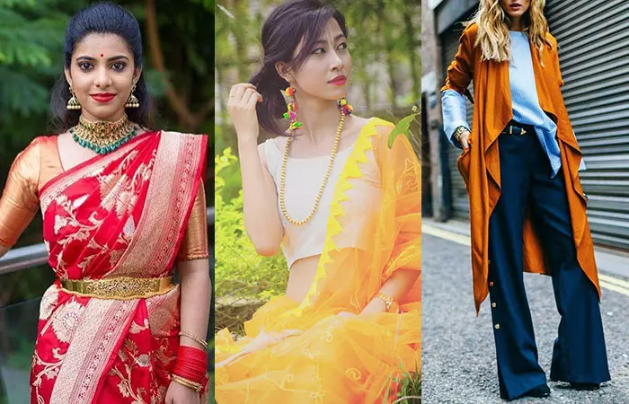
Keeping it in the family is a mantra you need to remember. The safest way to do this is by blending different shades of the same color. However, this type of chromatic dressing will inevitably get monotonous and boring very soon. Remember how we discussed complementary colors? (Red and green, violet and yellow, blue and orange.) Play around with a combination of these colors; they will look great when put together.
Experimenting with layered textures in similar color families will also add a depth dimension to your look. This technique will allow a person to express his or her personal style using mixed textures. The sensations in the materials make the whole ensemble more interesting.
- The Ombre Test
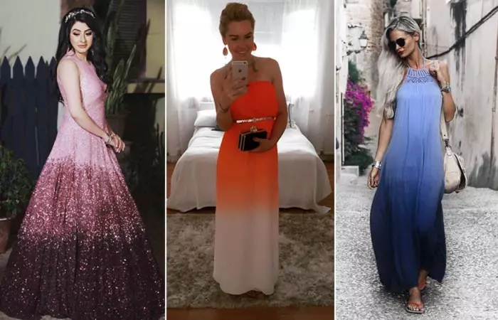
Ombre is taking over everything from hairstyles and cakes to nail art and decor, and not to forget, outfits. Party-wear outfits, bridesmaid dresses or just simple jeans and tops in ombre can turn heads. Picking diminishing shades of the same color either in ascending or descending order from the fashion color wheel works great. If you are sporting separates, you need to bring it all together with the top, bottom, shoes, and accessories being in sync. Wear ombre outfits for your Christmas or winter parties, goes perfectly with the theme, and the weather too.
- Monochrome Look
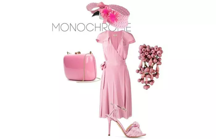
It seems like a no-brainer because it’s just one color in the same shade for the entire outfit. However, this color coordination is the hardest to pull off, for obvious reasons. The good news is monochromatic looks have caught up and are not considered weird anymore. Start with comfortable and neutral colors like grays, blues, whites, and blacks, then progress to pastel undertones. Monochrome looks can be customized depending on the season or occasion. If it’s a formal set up, stick to neutrals, blues or whites, otherwise explore the pastels, yellows or even brighter shades if you please.
- One Thing At A Time
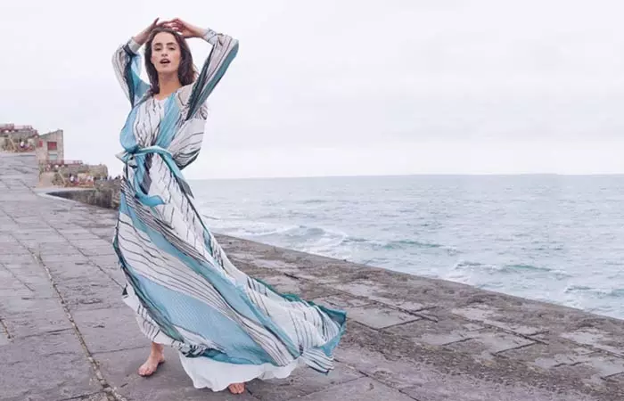
If it’s a printed or patterned outfit, let the print take over. Prints and patterns are usually a combination of one or more colors, so you must leave it at that. Keep the accessories in the neighborhood; more colors only makes it clumsier and unruly.
- The Balancing Act
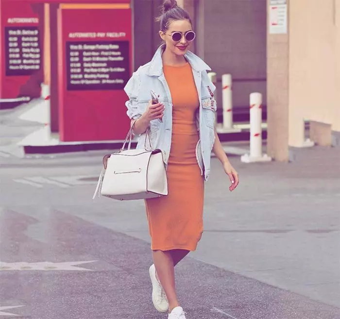
Another trick of the trade is to balance out any colors you choose to mix carefully. Anything done proportionately is a foolproof way of coordinating your outfit. Like they say, too much of anything is good for nothing.
An enthusiastic fashion blogger known for her insights into clothing and style expresses her admiration for different colors, styles, and prints. When talking about color combinations, she says. “I love the way the two dark colors come together and give me one long line. And I love the warm richness of this combination. Brown and black are both classic neutrals which means that they go with everything, including each other (i).”
- Match It With Your Skin Tone
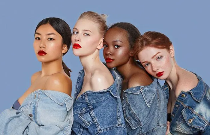
If you are pale or yellow-toned, go for the warmer side of the palette. You can pull off brighter or warmer shades of brown, coral, honey, gold, amber, taupe, etc., as they look amazing on this skin tone.. If you have cooler undertones choose cool shades like grey, navy blue, varying shades of green, aqua, emerald, burgundy, etc., as they can be the perfect color combination for your dress that suits your tone. The same applies to your eye makeup too.
- When In Doubt – Err On The Neutral Side
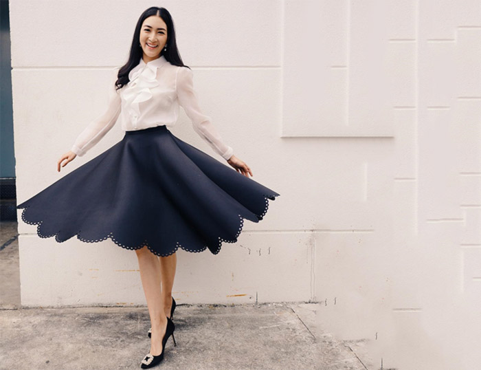
Some people prefer being muted and subdued with their choice of colors, opting for just neutral shades. This is a great color combination for a dress, especially for formal occasions. If this is you and you do not want to change drastically, go with one cool or warm color, and leave everything else neutral. It’s always best to keep it this way!
These color combinations are just the perfect hues to add to your wardrobe. Now you know all about color combinations that make you look interesting, fashionable, and balanced. Moving on, let us learn how exactly to use the color wheel for everyday styling in the next section.
These color combinations are just the perfect hues to add to your wardrobe. Now you know all about color combinations that make you look interesting, fashionable, and balanced. Moving on, let us learn how exactly to use the color wheel for everyday styling in the next section.
How To Match Clothes Using The Color Wheel
To apply the basic color theory and use the fashion color wheel to mix and match outfits from your wardrobe, here is what you need to consider:
- Color-Based Wardrobe Organization: Organize your wardrobe according to color families like neutrals, blues, yellows, greens, reds, etc., so that they are convenient to compare and contrast side by side. It also helps you create harmonious ensembles as colors from the same family naturally complement each other.
- Neutral Color Base: Pick outfits in neutral base colors like beige, white, black, grey, and navy to create the foundation of your wardrobe. These base colors can be paired easily with different hues and help to balance bold colors.
- Unique Print And Pattern Experiments: Include patterns, prints, and textures like stripes, checks, florals, knits, silks, etc., into your wardrobe. These elements can add depth and accent to your wardrobe while helping you stay aligned with your color palette and personal style. You may also use prints, patterns, and textures to break up bold color schemes.
- Monochromatic Palette: Whenever in doubt, stick to a single color palette to achieve a cohesive look. You can consider combining different textures like silk and leather to elevate your look.
- Soft-Contrast Ensembles: When using the split complementary scheme, pair the base color with two adjacent colors to create a soft contrast. For instance, style a blue-hued outfit with a red-orangish bag.
- Dynamic Ensembles: When using tetradic schemes, mix two complementary color pairs like blue and orange with yellow and purple to create a dynamic look. Make sure that one color pair is dominant to avoid competition for attention.
- Balanced Ensembles: Style vibrant-hued outfits with mute-toned attires to add depth and a sense of balance to your look.
- 60-30-10 Design Rule: While styling your attires, stick to the 60-30-10 design rule. This means to allocate 60% of your look to a dominant hue, 30% to a secondary hue, and 10% to an accent color to create a well-balanced look.
- Seasonal Colors: Pick colors according to the season. For example, it is ideal to go for light and neutral colors for summer, pastel colors for spring, earthy tones for autumn, and dark colors and jewel tones for winter.
- Colors For Special Occasions: Wear colors according to your personal style and occasion. For instance, business meetings and professional events call for shades that exert professionalism like black, grey, navy blue, etc. Opt for bright and bold colors for gala and creative events. Earthy tones like brown, mustard, and terracotta look great for casual outdoor occasions.
- Contrasting Accessories: Use accessories in contrasting colors to create an eye-catching contrast and add a bit of glam to neutral or monochromatic outfits.
Infographic: The Ultimate Color Wheel Guide For Your Clothes
Some people have a natural knack for pairing the right colored clothes together. But if you are the opposite, we have something for you. There are three simple rules to follow when choosing colors for your clothes. Follow them and you will always look like the queen you truly are.
Check out the below infographic to find the ultimate color wheel guide for your clothes. Illustration: StyleCraze Design Team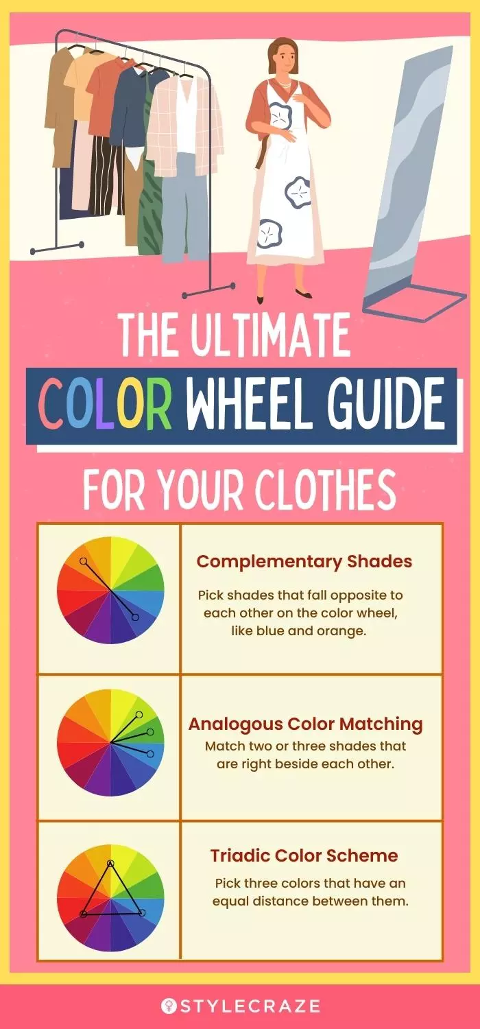
Dressing up is not just about throwing random pieces of clothing onto the body. It indeed is an art and requires thoughtful efforts. Certainly, the fashion color wheel has opened the eyes of many and made them see the significance of colors and their combination in clothes. It is important to know how to mix and match colors for your outfits to bring out your personality better. Personal stylist Paola Farina says, “When in doubt, find a professional for a color analysis. One way to find out which colors suit to better is to look at your veins. Green veins equal a warm undertone and blue veins equal a cool undertone. Furthermore, if coral lipstick shades suit you better, you have a warm skin undertone, and if strawberry shades look good on you, your skin has a cool undertone. So, go for similar colors.”
And this is not restricted to everyday fashion! This approach to color matching can also inspire wedding color combination ideas, ensuring a harmonious palette for your special day. So, refer to the steps above to know the best color combinations for dresses that suit females. As a wearer, you must be able to feel comfortable in the colors of your clothes and let them speak about you.
Frequently Asked Questions
What is the relationship between the fashion color wheel and color theory?
The fashion color wheel is based on color theory and provides a visual representation of how colors relate to one another. It is useful in fashion design for choosing color combinations for clothes that complement each other.
How does the fashion color wheel differ from the traditional color wheel?
The fashion color wheel typically includes more colors than the traditional color wheel and takes into account the current trending colors in fashion. It also may have different groupings of colors, like seasonal color harmonies, specific to fashion design.
What is the difference between a fashion color wheel and a regular color wheel?
The regular color wheel focuses on basic color relationships and is used mainly in art and design, while the fashion color wheel is specifically tailored to the needs of fashion design, includes more colors, and considers current fashion color trends.
Do you want to learn how to read the color wheel and enhance your look? Watch this video to create stylish and satisfying outfits, using simple color wheel tips.
Personal Experience: Source
StyleCraze's articles are interwoven with authentic personal narratives that provide depth and resonance to our content. Below are the sources of the personal accounts referenced in this article.
i. Color Combinationshttps://truetzniutistruebeauty.wordpress.com/2025/09/01/color-combinations/
Read full bio of Paola Farina
Read full bio of Pahul Nanra
Read full bio of Madhumati Chowdhury
Read full bio of Bhumika Daga







Community Experiences
Join the conversation and become a part of our empowering community! Share your stories, experiences, and insights to connect with other beauty, lifestyle, and health enthusiasts.